
Parabolic AI
Scaling UI visuals and interactions ahead of a MVP launch
UX/UI Design
Design Systems
The Challenge
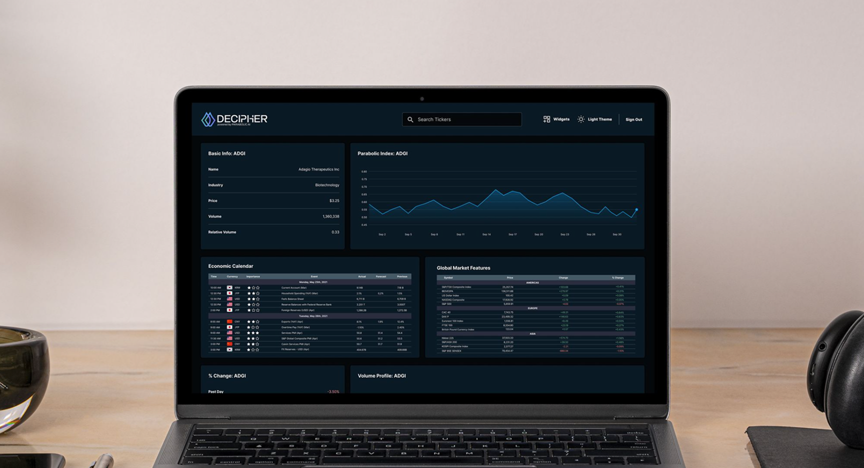
Parabolic AI, a market intelligence startup, needed to improve the UX of its customizable trading dashboard ahead of a soft MVP launch. Users found the interface overwhelming: dashboard widgets had no context were confusing to use, UI elements were inconsistent, and product navigation was difficult. Our objective was to provide their developers with guidance on how to improve these features before going public.
Our Approach
We conducted a UX audit to identify and document key usability issues while providing scalable solutions for how to simplify layout and navigation, define UI systems, and make primary interactions more intutitve. These changes helped clarify the product’s core value, created a scalable design framework, and set the foundation for users to have an enjoyable product experience ahead of launch.


